this week in pictures.
the living room painting project from hell is half finished. we started with the trim and it wasn't long before i got tired of painting. so i did this instead:

by the way, that was a bad idea. it took five coats to cover it up, and the heart is still sort of visible. we have learned many lessons while painting, like the importance of using tinted, not white, primer. that lesson, it was painful. you would think that since this is room painting project #4, we would have learned these lessons long ago (perhaps on room #1 or 2). but no.
and that bar going across the living room, at the top of the picture--that is one of four metal tension rods that helps to keep the walls standing and the roof from squishing them flat. the people who remodeled our house decided to go with relatively unobtrusive metal support beams (that are then attached to metal supports in the walls) across the living room, instead of something like rafters. the first time someone sees our house, the conversation goes like this:
new person: what are those?
me: tension rods. they help hold up the walls.
np: no they don't!
me: yes they do!
np: that's impossible!
me: that's what i said. but really, they do.
np: i don't believe you.
me: you don't have to.
i know they're there to support the walls because 1. i haven't been squished to death by the roof yet and 2. they're ugly as hell, so why would anyone put those up for aesthetic reasons? i didn't think so.
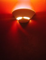
below is a picture of the finished wall. the color is a deep red called cherry cobbler, which never fails to make me hungry. i like the range of color that showed up in this photo even if it looks nothing like the actual color.

and here, for good measure, is a picture of my dogs with their death ray eyes. see the beige wall behind them? that's the nasty color that's being covered up by the pretty red paint.


0 Comments:
Post a Comment
<< Home